UI Builder - The Basics
- sajan Allan Roy R
- Jun 28, 2021
- 3 min read
Updated: Jul 7, 2021
UI Builder is a powerful tool that allows developers to configure agent workspace and portal pages and their associated experiences. Though this is primarily targeting citizen developers, the present and the future versions are considered to be for all developers who would possess this skillset - and this is exactly what I am planning to get, starting this post.
Key focus areas of UI builder are Agent Workspace pages and Portal pages.[Plugin: com.sn_ui_builder]
Support domain separation - basic support level. Learn more: https://docs.servicenow.com/bundle/quebec-application-development/page/administer/ui-builder/concept/uib-domain-sep.html
Available App shells:
Agent Workspace App shell
Portal App Shell
Tip: If you are wondering what the UI style of the new UI builder is termed as, it's called WYSIWYG - What you see is what you get. This type of UI is most seen on web-design pages that allow drag/drop-type of configuration, with a real-time UI.
Creating an App experience:
Open the UI builder > Click on 'Create Experience in platform'.
Give the experience a name
Select the portal app shell on the App shell field
Provide a URL suffix
Select/create a Admin panel (for new, create a new UX App config)
Some Important Components (can't cover em all):
Layouts - Allows designers to select from a number of layouts for components on the page. Supported types - Row column(legacy), Flexbox, CSS Grid, Free/absolute positioning

Page Templates - On creating an app experience or adding components into it, the creation of pages plays an important role. Either can be created from a template (most page templates are read-only) or create an empty page so that you can add containers and multiple components as you wish. Page templates can also be utilized by only copying the contents to your page when creating a page from a template. By doing this, the page content will be editable.

Page Parameters - Pages can have required or optional that can be passed to them parameters via scripts or events.

Page Variants - Pages might have to behave differently for different audiences, this is where variants come in handy. Copies of the same page can be made and targeted to different audiences with dynamic styling and configuration. 'Audience' is analogous to User criteria, however limiting only to roles.
Conditions can also be used for page variants (as an encoded query). A typical example of the use case: A page has the required parameter as 'color'. When the page is called, if the parameter passed is not blue, then display a different variant of the page :) Cool Ain't it?
When the UX Framework user criteria is enabled, control can be brought in based on: Roles, Groups, User, Company, Department, Location, script.
Components - Usually utilized when a page without a template is created - allows us to add multiple components into pages, to name a few: rich text, pills list, comparator, buttons, scores, color pickers, calendars, loaders, progress bars, KPIs, even iFrames!

Modals - Just like components, modals can also be added to pages. Like a confirmation modal, or s simple alert modal. One of its types, 'Modal viewport' allows us to dynamically pass content through an event binder from client script.

Tip: UI builder (Quebec) is different from UI Builder(Orlando). UI built in pre-quebec cannot be configured with the quebec version.
Configuration panel - This panel comes into play after components are added to the page. Has tabs that handle different aspects. Also has visibility control for that component.

Data resources - Unlike our legacy situation, where every page component more or less defines its own data to process, the new UI builder allows us to dynamically configure and fetch from data resources, which renders on the page by data binding. Methods to fetch data - Glide, GraphQL, REST API.

These data resources can later be utilized in the components, for example, a simple text component can have its value coming from a glideRecord data resource.

Event, Event Handlers and Event Mapping - Events can be triggered by a multitude of ways, which will be processed by event handlers (mostly scripts), the configuration for which needs to be done using event mapping. Following are the types:

Client State parameters - Supports string, boolean, number, JSON types. These components can be accessed by components using the @state.[clientstatename]. For example, a user's name is fetched below:

Client scripts - Javascripts that help update the client state parameters. These scripts can be bound to components using event handler. Added using the Now Code editor integrated into UIB.
Some important data binding elements - @state - for getting client state parameters, @parameters, @data - for getting data resources, @elements - to set values from elements; for example, a list menu can be tweaked using @elements to show appropriate table, list, condition, title; @payload - to probably process values across pages (from what I read).
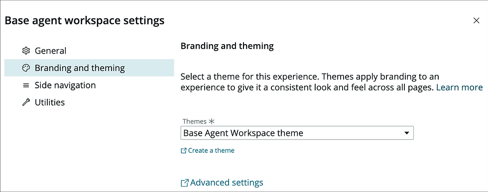
Themes - UI builder allows a theming across various experiences.


Comments